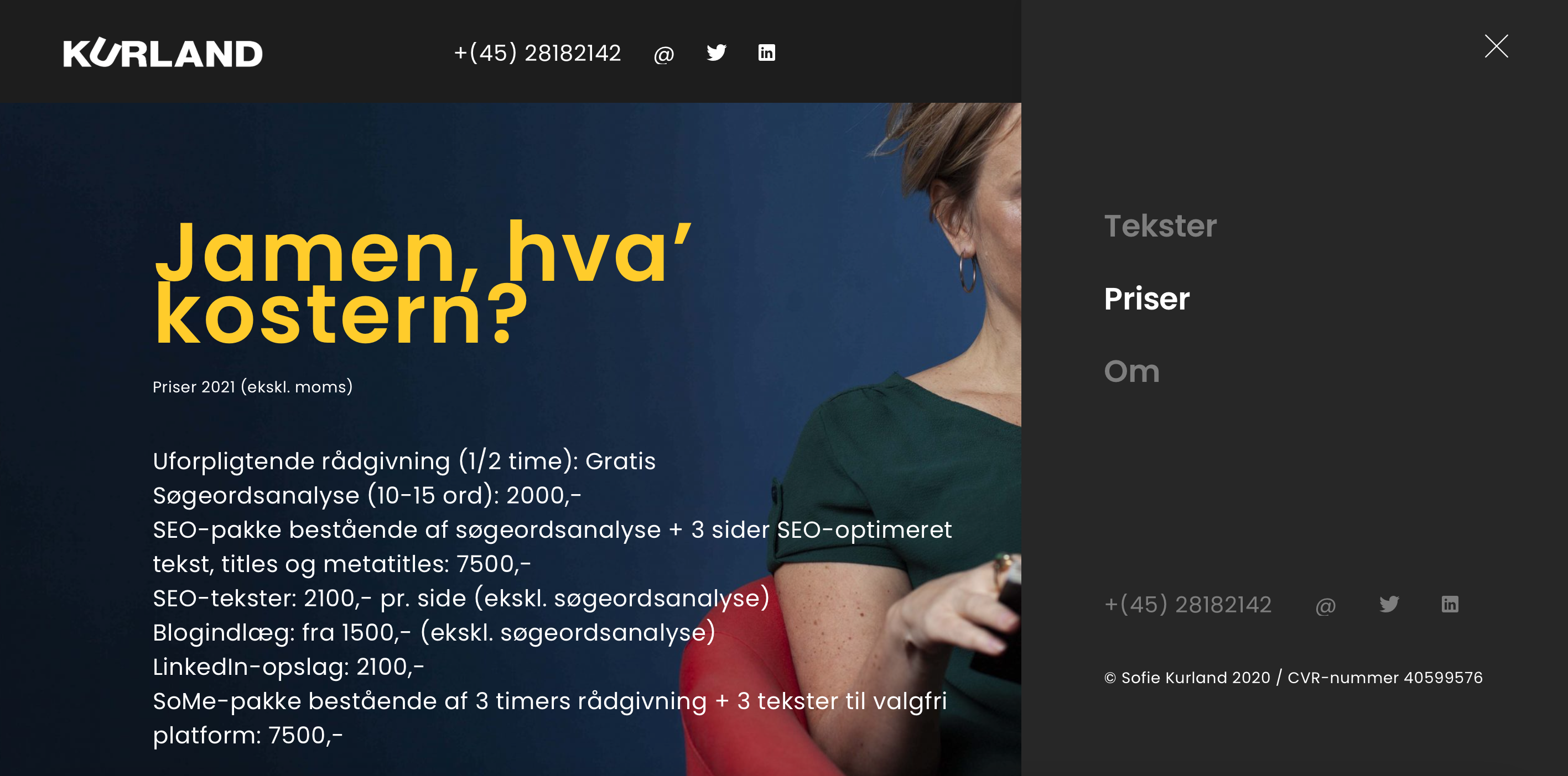


How could we create a website that shows a copywriter’s business background in a simple setting?
Having previously worked with Sofie Kurland on other projects, she came to me when she was in need of someone to redesign her new website. I used UI-frameworks focused on patterns and interaction behaviours, but customized the design so each stood strongly on its own. Since Kurland focus on copywriting and strategy, my main goal was to showcase her own words in a different way.
UI components
Adobe Photoshop
Adobe InDesign
Axure
CSS
HTML
Controls
Grids
Colors
Typography
Keyboard shortcuts
Focusing on design goals and principles, together we dicussed guidelines, components and patterns, contextual examples and the writing style.
How do we arrange components on the screen?
What problems does this components address?
Why should we used this component?
