Introduction
For DMI, we were developing a mobile weather tracking application. DMI wanted a redesign for their weather app.
This project resulted in numerous UX improvements and some consolidated styles, but nothing to address a fundamental problem: DMI was dated and had fragmented over time due to the lack of designers. It was a concern that the look and feel of the app had an impact on user sentiment and sales prospects, despite having no easy way to quantify it.
A redesign of the look and feel of the app was necessary at some point, and we had a short window of engineering time on the schedule. With only a couple of months, how could we update the interface of the whole app, from design to launch?
Project scope
As UX Designer my role was to create a high-fidelity clickable prototype for the app that could undergo usability testing. The prototype should have two screens: one that displays the daily schedule in a high-level manner and another that displays details about each day.
Goals & deliverables
- Users should be able to view the current weather conditions in their area
- Provide users with the ability to make decisions based on the forecast during the week
- User growth
- Brand awareness
- Making weather forecasts easy to understand
Next, we mocked up a typical DMI screen using two to three new styles. What was the specific requirements and constraint? Could the new styles be related to their website’s broader brand?
“A mobile application which aims to track daily forecasts and receive live radar updates, storm alerts, & local precipitation updates.”
User Persona

Goals & challenges
- A weather forecast should be easy to understand
- Users should be able to make decisions throughout the day with the help of the day detail page
- The overview screen should provide users with immediate information about the week ahead and the current time
Challenges
- A single screen that contains all the forecast information
- Determine which data to display
- Make sure information is easy to read and understand
Key metrics
- Launch rate
- App download
- Number of active users
- Turnover rate
- Engagement
- Reachability
- User lifetime value
Options
- Weather iconography to quickly communicate forecasts and weather conditions
- Minimal layout to keep the user’s attention
- A background that reflects the current temperature
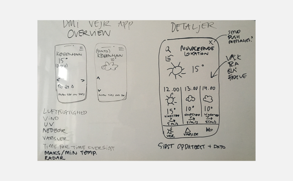
Wireframes

UI Examples, Research

UI Design
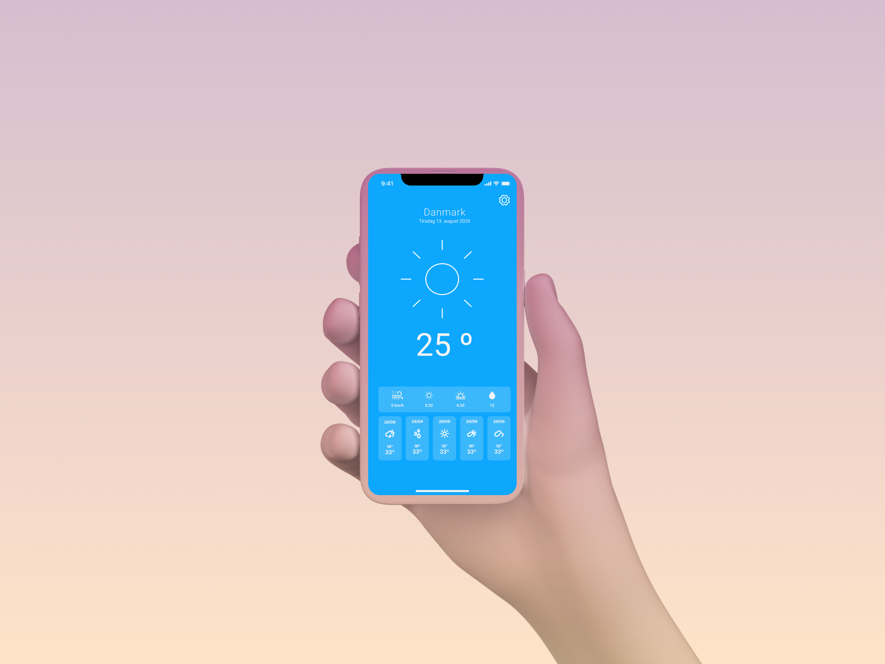
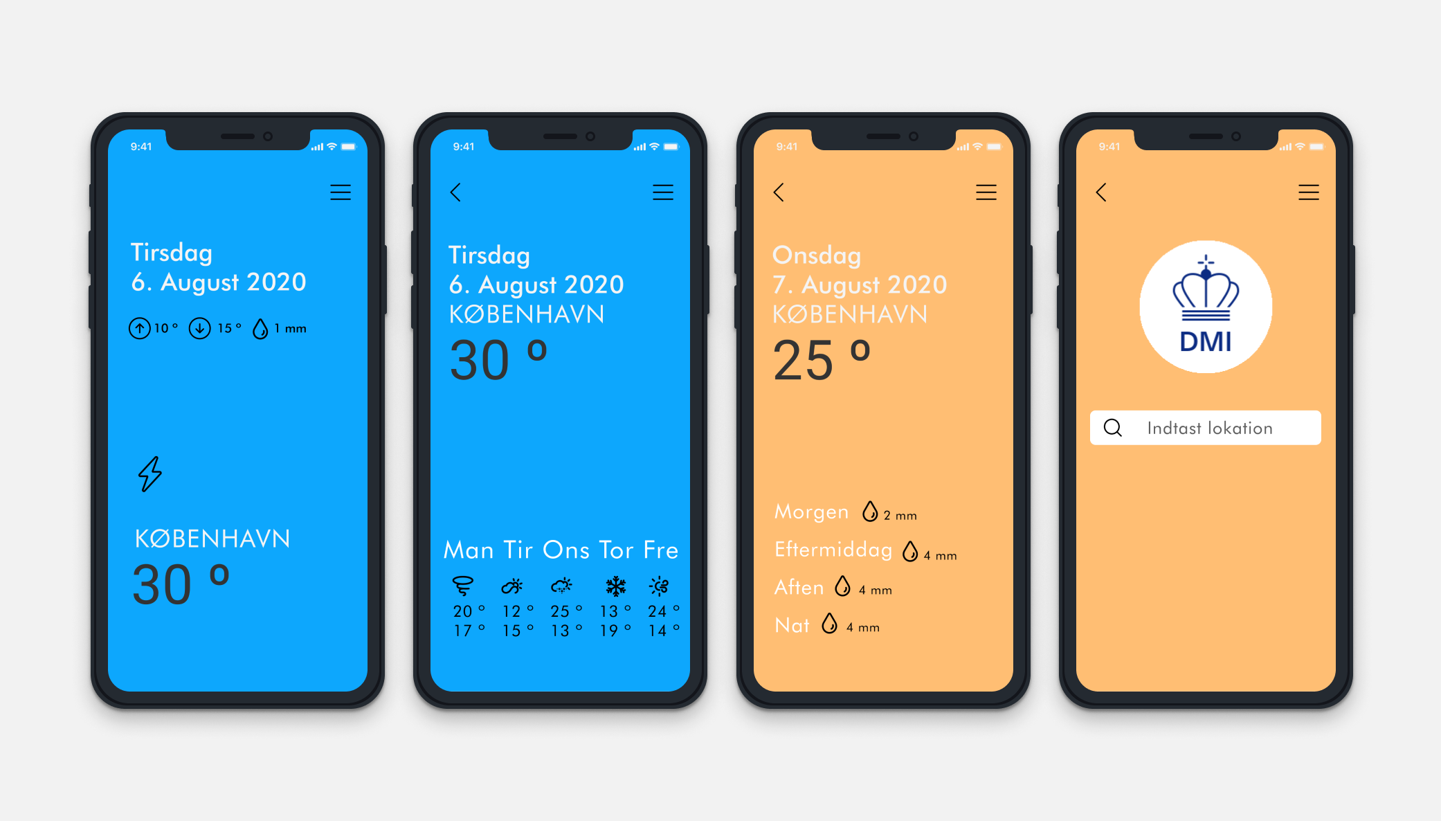
The app includes clean typography, plenty of white space, and bright background colors in order to present DMI forecasts in a clear and concise way. No clutter.
Iconography & minimalist design
Minimalism’s primary goal of eliminating the unnecessary. Using icons to display the forecast for the next days allowed us to communicate the forecast more effectively than using a lot of different numbers and text. To minimize the amount of screen real-estate used so that every element has enough breathing space.
Flat Patterns & textures
The use of flat interface, and erasing the obvious highlights, shadows, gradients and other textures that make the UI elements look glossy or three-dimensional. In most minimalist interfaces, color is used strategically to create visual interest or direct attention without adding any additional design elements or actual graphics. With less visual information vying for a user’s attention, color palettes are more noticeable and will be more influential in a site’s impact (nngroup 2015) .
Maximized white space
I use it as a tool to try to direct users’ attention and allow them to digest the content more easily. Never sacrifice usability to suit a specific design aesthetic, make sure that the users understand your UI. When deciding how to lay out white space in our designs, we considered the following questions:
- What effect will adding or removing white space have on the hierarchy communicated by the app?
- Is the white space affecting the display of content?
- What will happen to the interaction cost of white space: will users have to work harder in order to access the information they need?
Figma Prototypes


