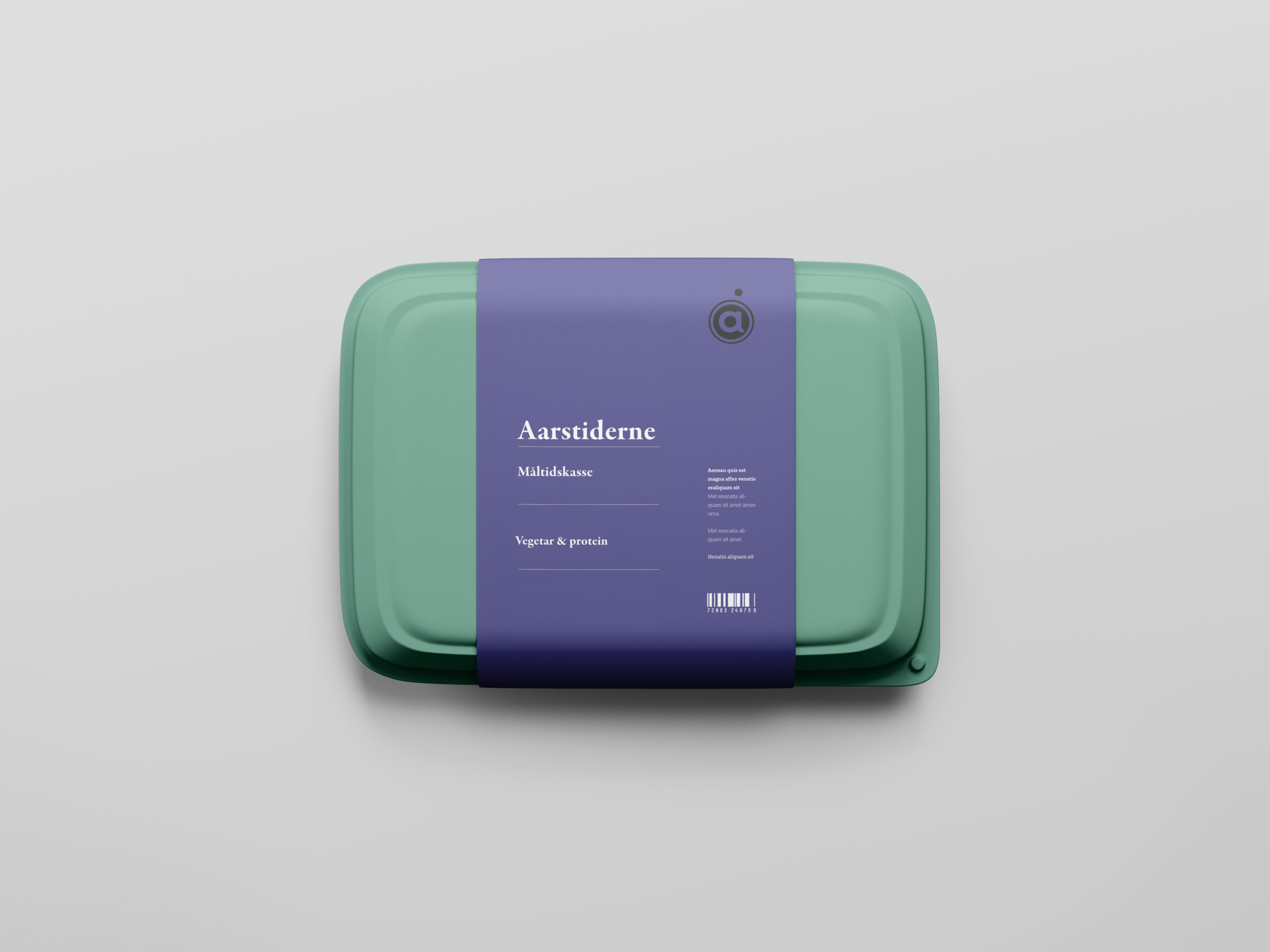
Aarstiderne recreate the close connection between the cultivation of the land and the joy of organic meals, filled with good ingredients, taste experiences and presence. This was a seasonal campaign pitch with main focus on rebranding.
While Aarstiderne remains the same, their publishing tools, reading platform and content offering are ever-advancing to better serve this mission. As the world changes around us, they aim to create a more intentional and relational network of ideas exchange. This updated brand identity is meant to provide a better expression of who Aarstiderne are, where we came from and where we’re going.
Their previous branding did not have the flexibility to build and evolve. They needed a scalable system of design elements that were easier to spin up, particularly for future marketing initiatives. The color palette was too pared back, subtle, and limiting. They wanted more flexibility and room for bold expression.
APPLICATION SCREENS


HOW IT WORKS


